
Cross-browser compatibility means your website looks and works correctly in the browsers your visitors actually use, such as Chrome, Safari, Edge and Firefox, on both desktop and mobile. Browsers handle HTML, CSS and JavaScript slightly differently, so a page that looks perfect in one can break in another. This guide lists practical steps to avoid that.
Quick answer: how do you make a website cross-browser compatible?
Write standards-based code, check feature support before you rely on a feature, add fallbacks, avoid browser sniffing, and test on real browsers and devices, not just one. Start with the browsers your own analytics show, then widen coverage.
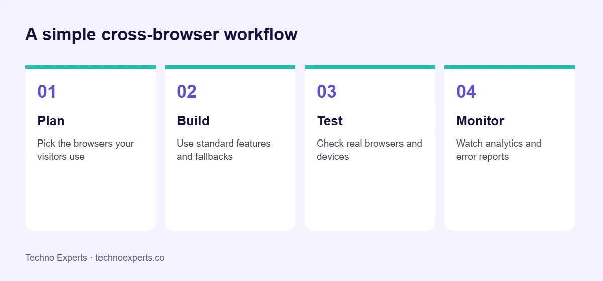
1. Decide which browsers matter
You cannot test everything, so use data. Check your Google Analytics or Search Console reports for the browsers, versions and devices your visitors use. For many Indian business sites, mobile Chrome and Safari on iPhone make up most traffic, with Edge, Firefox and Samsung Internet behind them. Set a clear list and review it each quarter.
2. Use standards and check support
Stick to standard HTML, CSS and JavaScript. Before using a newer feature, look it up on MDN Web Docs or Can I use, which show support in each browser. If a feature is not supported everywhere, build the page so it still works without it.
3. Build with progressive enhancement
Start with a simple version that works everywhere, then add improvements for browsers that support them. CSS feature queries (@supports) and JavaScript feature detection let you do this safely. This is better than checking which browser someone uses, which breaks as browsers change.
4. Reset or normalise default styles
Browsers apply different default styles to headings, buttons, forms and spacing. A short CSS reset or normalise file gives every browser the same starting point, so your own styles behave the same.
5. Let tools add vendor prefixes and fallbacks
- Use a tool such as Autoprefixer to add vendor prefixes where needed.
- Use a build tool and a browserslist setting so your code is compiled for the browsers you chose.
- Load polyfills only when a browser needs them, so modern browsers stay fast.
6. Watch common trouble spots
- Mobile viewport height: full-screen sections can be cut off by browser toolbars on phones. Test them on a real device.
- Form controls: dates, selects and buttons look different in each browser, so test them.
- Fonts and images: use widely supported formats with fallbacks, and always set image sizes.
- Flexbox and grid layouts: well supported now, but spacing and overflow can still differ.
- Third-party scripts: chat widgets, maps and ads can break layouts in one browser.
7. Test on real browsers and devices
Open your key pages in each browser on your list: home page, service pages, forms and checkout. Browser developer tools can emulate phones, but a real device shows touch behaviour and performance that emulation misses. Automated tools such as Playwright can run the same checks in Chromium, Firefox and WebKit, which is useful when you update the site often.
8. Monitor after launch
Browsers update every few weeks. Review analytics, error reports and customer feedback so you catch problems early. A site care plan that includes regular testing keeps issues from building up.
A simple cross-browser checklist
- Browser list based on real analytics
- Layout checked on mobile and desktop
- Forms submit correctly in each browser
- No console errors on key pages
- Images, fonts and icons load everywhere
- Page speed checked, including Core Web Vitals
SEO, AEO and GEO: what do they mean?
SEO helps your pages rank in Google. AEO (answer engine optimisation) means giving clear, direct answers that appear as featured answers. GEO (generative engine optimisation) means making your content easy for AI tools such as ChatGPT, Gemini and Google AI Overviews to read, trust and cite. See our glossary for details.
Frequently asked questions
Which browsers should a website support?
Support the browsers your visitors use, which you can see in analytics. For most sites this means current versions of Chrome, Safari, Edge and Firefox on desktop and mobile.
Is cross-browser testing still needed?
Yes. Browsers have become more consistent, but differences remain in forms, mobile behaviour, new features and performance, so testing is still needed.
Should I test on real devices?
Yes. Emulators help, but real phones and tablets show touch, scrolling and performance problems more reliably.
What tools help with cross-browser testing?
MDN Web Docs and Can I use for support information, browser developer tools for debugging, and Playwright or cloud testing services for running checks across browsers.
Does cross-browser compatibility affect SEO?
Indirectly. A page that breaks or loads slowly in a common browser loses visitors, and Google measures page experience. A working, fast page helps both users and search.
Need help with your website?
Techno Experts is a web design, SEO and AI company in Warje, Pune. See our website development and website maintenance services, or talk to the team. You can also run a free website health check. We reply within 24 hours.
Written by the Techno Experts team, Pune. Reviewed by Suresh Shinde. Last reviewed October 2026.
Need help with browser testing or a new website?
Techno Experts is a website development company in Pune. We test every build across browsers and devices. See our development service or estimate your cost.